The Ultimate Guide to Quilt Color Schemes
Have you ever marveled at a beautifully crafted quilt and wondered what makes it so captivating? The magic lies in the colors. Color choice is crucial in quilt-making – it can make or break a design. In this article, we present the ultimate guide to quilt color schemes, where we demystify the process of selecting and combining shades. Whether you’re new to quilting or an expert, this guide will help you create eye-catching designs that will leave everyone in awe. From understanding color theory to exploring modern quilt color schemes, we’ve got you covered. So, let’s dive into the colorful world of quilting and unleash your creative potential.

I like color. I did a mystery quilt sample once with a hot pink background while everyone else used a cream or white, the brief just said a light color and it read light when paired with other fabrics. My recent quilt pattern Down The Brick Road is much more subtle than I normally do. While for some going bright and bold is a departure sticking to the subtle colors is my departure from normal. I want you to be confident in picking your quilt color schemes not matter if you want bold in your face or subtle and light colors.
Understanding Color Theory
To fully understand how to create eye-catching designs in quilting, it’s important to have a solid understanding of color theory. By familiarizing yourself with color terminology for quilting, you’ll be able to confidently choose and combine colors and shades that work well together. Let’s take a closer look at some key terms that are commonly used in quilting color schemes.
Color Terminology for Quilting
To create beautiful and eye-catching quilt designs, it’s important to have a solid understanding of color theory. By becoming familiar with common color terminology used in quilting, you’ll be able to confidently choose and combine different shades to achieve your desired effect.
One important term to know is “hue,” which refers to the pure color on the color wheel, such as red, blue, or yellow. “Saturation” refers to how much of that pure hue is present in a particular shade, with high saturation being very vibrant and low saturation being more muted.
“Value” is another key term in quilting color schemes, referring to how light or dark a particular color is. High-value colors are lighter, while low-value colors are darker. Understanding value is important for creating contrast and depth in your quilt designs. If you have problems telling values in fabric we have some great tips for find your fabric’s color value. This will be helpful if you want a monochromatic color scheme for your quilt.
Lastly, “temperature” describes whether a color is cool or warm. Cool colors have blue undertones, while warm colors have yellow undertones. Combining cool and warm colors can create balance and interest in your quilting projects.
By having a solid understanding of these key color terms, you’ll be able to confidently choose and combine shades to create stunning quilts. In the next section, we’ll delve into some practical tips for selecting quilt colors that work well together.
Quilt Color Scheme Terminology
Below I will show you six different color combinations using the tumbling block quilt. There are more color schemes that can be used in quilting but I wanted to keep it simple for this guide.
Creating dynamic quilt color combinations is an art that can be mastered with practice. To achieve a quilt that is visually compelling, it is important to think about color in terms of balance, contrast, and texture. One way to create a dynamic color scheme is by using the color wheel. Colors that are opposite each other on the wheel, such as blue and orange or green and red, are called complementary colors. Pairing complementary colors can create a harmonious yet bold contrast.
Another method is to use monochromatic colors, which are different shades and tints of a single color. This can create a sophisticated and elegant look that is easy on the eyes. Analogous colors, which are adjacent on the color wheel, such as yellow, yellow-green, and green, can create a warm and cohesive look.

Neutral Colors
You can always use a neutral color to settle a quilt color scheme down. A white, black, gray, or a very pale color will give your eye a place to rest. If you like bold colors, like me, the neutral color gives it balance and keeps it from becoming overwhelming.
Monochromatic
Mono means one and this quilt color scheme uses one color in various saturations and values. You can do a lot with just one color, think ombre quilts. This example is just greens, the light green could even be lighter to show more contrast.

Analogous
The analogous color scheme can be used with 3 or 5 colors. To pick an analogous color scheme, start by picking your focus color from the wheel and add the color on each side of it. If you want to expand to five colors you can add the color next to the supporting colors. Using a CMYK color wheel, like shown above, will not have as big of steps in color as a traditional color wheel.

Complementary
The complementary quilt color scheme uses colors directly across from each other on the color wheel. I know what you are thinking, the tumbling block quilt needs at least three colors but you can add a neutral color. The neutral I used here has just a tinge of blue it adds just a little something more to the quilt.

Split Complementary
The split complementary color scheme is when instead of taking the color directly across the color wheel you take the colors on either side of that color. It can make a very striking quilt because there will be a lot of contrast but it won’t appeal to everyone because of how bold it is. I personally love this dark blue, mint green, and greenish-gray.

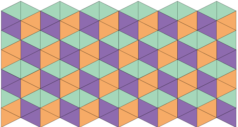
Triadic
The triadic color scheme is probably my favorite color scheme for my quilts. The three colors are from equal distances around the color wheel. This is a bold color palette and it makes bold striking quilts.
Tetradic or Rectangle
The tetradic color scheme is also known as the rectangle color scheme because the four colors used make a rectangle. The tumbling block only uses three colors so adding the fourth color was not possible.

Practical Tips For Selecting Quilt Colors
Having a basic understanding of color theory is an essential first step in selecting colors for your quilting projects. But how do you put that knowledge into action? Here are some practical tips for selecting quilt colors that will work harmoniously together:
- Start with a focal fabric. Choose a fabric that you love as your inspiration and build the rest of your color scheme around it. Look for colors in the focal fabric that you can pull out and use as accents.
- Invest in a color wheel. You can use an art color wheel or a quilt color wheel. The quilter’s color wheel has disks to help pick your color schemes. It even has more color schemes than I listed above.
- Buy a subscription to Coolors.co. This is the website that I used to pull the colors for the above examples. A subscription is $3 a month and allows you to add up to 10 colors to the color palette that you pick.
- Consider the mood you want to create. Different color combinations can evoke different moods. For example, cool colors can create a calming effect while warm colors can create a sense of energy and excitement.
Using these tips you can select colors that work seamlessly together to create a dynamic and eye-catching quilt.
Modern Quilt Color Schemes To Inspire Your Designs
Modern quilt color schemes offer a plethora of options for quilt makers seeking to create unique and eye-catching designs. Let’s see what color schemes from above lend themselves well to a modern quilt.
One trend in modern quilt color schemes is the use of monochromatic color schemes. This can create a cohesive and calming effect that showcases the various shades and hues of the chosen color.
Another modern quilt color scheme is the use of analogous colors. I prefer the analogous color scheme because it has a little more contrast than a monochromatic but this is a personal decision.
Bold and bright colors, such as hot pink, bright orange, and electric blue, are also a popular choice for modern quilt color schemes. These colors can add a playful and energetic element to your quilts, making them stand out and draw attention.
Finally, using unexpected color combinations, such as pairing pastels with neons or mixing warm and cool colors, can create a striking and unique design that is sure to impress. It’s your quilt, so if you like it go with it!
By incorporating modern quilt color schemes into your creations, you can add a fresh and contemporary element to traditional quilting techniques. With endless possibilities, the only limit is your imagination.,
Quilting is a beautiful craft that can be taken to new heights with the perfect color scheme. By understanding color theory, familiarizing yourself with color terminology, and experimenting with different color combinations, you can create eye-catching designs with ease. We’ve explored practical tips for selecting quilt colors, creating dynamic combinations, and even delved into the world of modern quilt color schemes. With these insights and a willingness to experiment, you’re well on your way to creating stunning, show-stopping quilts every time. So, next time you’re ready to start a new project, remember to have fun with your designs and never be afraid to mix it up. As Johann Wolfgang von Goethe once said, “He who knows others is wise; he who knows himself is enlightened.” Happy quilting!


